300 DPI vs 72 DPI: Print-Ready Coloring Pages (Exports + Examples)
300 DPI vs 72 DPI: Print-Ready Coloring Pages (Exports + Examples)
300 DPI vs 72 DPI print resolution hero
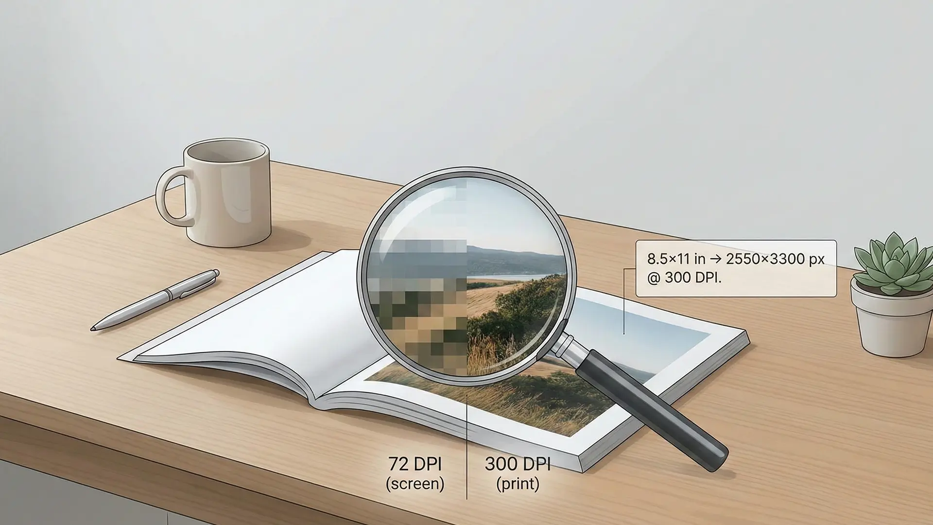
Stop pixelated, rough prints by understanding the single most common technical hurdle for KDP creators: resolution. This guide demystifies the difference between screen resolution (72 DPI) and print resolution (300 DPI), providing a framework to fix blurry AI art and ensure professional quality.
1.0 The Core Concept: Why Screen Images Fail in Print
The conflict arises from a fundamental mismatch: digital screens and physical printers use data differently.
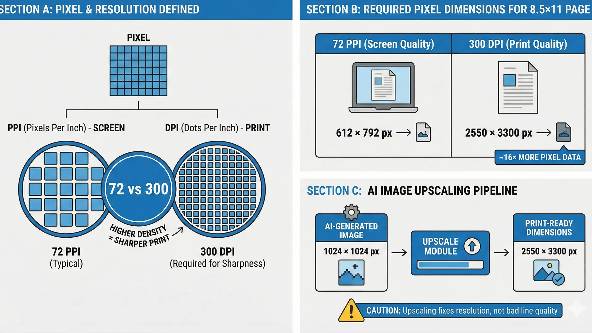
- Pixel: The smallest building block of a digital image (a single square of light).
- PPI (Pixels Per Inch): Screen density. Screens typically display at 72 PPI, which looks sharp on a monitor but lacks the data density required for ink on paper.
- DPI (Dots Per Inch): Print density. Printers fire microscopic ink dots to create continuous lines. High DPI equals sharp details; low DPI equals “pixelation.”
The Failure Point: When you send a 72 PPI screen image to a printer expecting 300 DPI, the printer must “stretch” the limited data. The result is a blocky, blurry, pixelated image—like trying to cover a wall with large, clunky tiles instead of fine mosaic work.
2.0 The Magic Number: 300 DPI Standard
For high-quality commercial printing (like Amazon KDP), 300 DPI is the non-negotiable industry standard.
2.1 Visualizing the Data Gap
The difference in required data is massive. Here is the pixel requirement for a standard 8.5” x 11” page:
300 DPI vs 72 DPI visual comparison chart
| Metric | Screen Resolution (72 PPI) | Print Resolution (300 DPI) |
|---|---|---|
| Dimensions | 612 x 792 pixels | 2550 x 3300 pixels |
| Data Density | Low (Screen Optimized) | 16x More Data |
| Print Result | Blurry / Pixelated | Sharp / Professional |
Analysis: A 72 PPI file contains less than 10% of the data needed for a full page print. Enlarging it guarantees blurriness.
3.0 The AI Art Challenge: Upscaling is Mandatory
AI image generators (like Midjourney or DALL-E) default to screen resolutions (often 1024x1024 at 72 PPI). These raw files are unsuitable for print without modification.
3.1 The Upscaling Workflow
To bridge the gap, you must use Upscaling software to intelligently add pixels. * Before: A 1024px image printed at 8 inches wide = 128 DPI (Blurry). * After: The same image upscaled to 2550px width = 300 DPI (Sharp).
Warning: “AI Slop” & Quality Control Upscaling fixes resolution, not artistry. You must still manually inspect for “AI Slop”—illogical lines, anatomical errors (six fingers), or weird artifacts. High DPI cannot fix a bad drawing.
4.0 Beyond Resolution: Critical File Setup
Resolution is just step one. You must also master the physical constraints of the printer.
4.1 Bleed and Margins
- Bleed: Add 0.125” (3mm) to outer edges so trimming doesn’t leave white gaps.
- Example (8x10 Book): File size must be 8.125” x 10.25”.
- Margins (Safe Zone): Keep text and key details 0.325” inside the trim edge.
- No Borders: Avoid printed borders. Slight trimming shifts make them look uneven and amateur.
4.2 Text Handling: Raster vs. Vector
Never flatten text into your image. * Raster Text (Bad): Flattened text becomes pixels. It looks fuzzy when printed. * Vector Text (Good): Text added in InDesign/Affinity remains mathematical paths, ensuring razor-sharp edges at any size.
5.0 Conclusion
Mastering resolution separates amateur projects from professional books. By upscaling AI art to 300 DPI and respecting bleed settings, you ensure your customers receive the high-quality physical product they expect.
Quick Checklist (Print-Ready Files)
- Resolution: Is the image 2550px wide (for 8.5”) to meet 300 DPI?
- Upscaling: Did you upscale raw AI exports before layout?
- Bleed: Does the document size include 0.125” extra on outer edges?
- Margins: Is all text kept inside the 0.375” safe zone?
- Text: Is text added as a Vector layer (not flattened)?