How to Build Color Palettes Using Psychology
How to Build Color Palettes Using Psychology
Color palettes influence emotions, decisions, and perceptions, making them essential for design. Here’s a summary of how psychology shapes color choices:
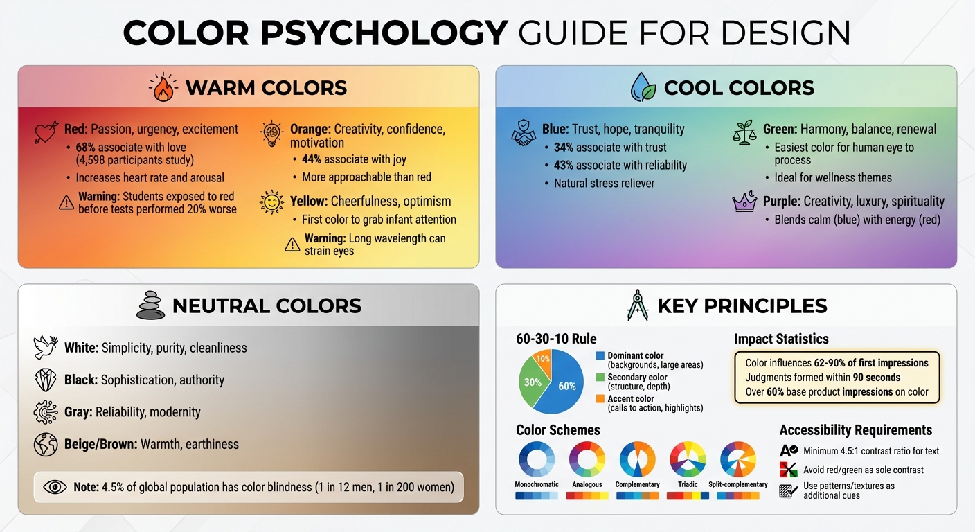
- Warm Colors (Red, Orange, Yellow): Energize and grab attention. Red evokes passion and urgency, orange fosters confidence, and yellow conveys cheerfulness but can strain the eyes.
- Cool Colors (Blue, Green, Purple): Calm and soothe. Blue builds trust, green symbolizes balance, and purple blends creativity with luxury.
- Neutral Colors (White, Black, Gray, Beige): Provide balance. White suggests simplicity, black conveys sophistication, and gray adds reliability. Beige and brown bring warmth.
- 60-30-10 Rule: Use 60% dominant color, 30% secondary, and 10% accent for balance.
- Color Schemes: Choose from monochromatic (one hue), analogous (neighboring hues), complementary (opposites), triadic (three evenly spaced), or split-complementary schemes.
- Audience Preferences: Younger people prefer bold colors; older audiences lean toward softer tones. Gender and cultural associations also matter.
- Accessibility: Ensure contrast for readability and avoid relying solely on red/green combinations.
Psychology-based palettes can enhance designs, evoke emotions, and support mental health and wellness when tested and aligned with the intended purpose.
Color Psychology Guide: Emotional Impact and Usage by Color Category
COLOR THEORY BASICS: Use the Color Wheel & Color Harmonies to Choose Colors that Work Well Together
How Different Colors Affect Emotions and Behavior
By understanding how colors influence emotions and actions, you can craft palettes that align with your design objectives - or, if used carelessly, work against them. Let’s dive into how warm colors energize and influence behavior.
Warm Colors: Red, Orange, and Yellow
Warm colors, reminiscent of sunlight, naturally grab attention and boost alertness. Red is particularly striking, increasing heart rate and arousal. It’s often linked to passion, urgency, and excitement. A global study involving 4,598 participants found that 68% associated red with love. However, red’s intensity can backfire in certain contexts. For instance, studies show that students exposed to red numbers before a test performed over 20% worse than those who saw green or black numbers. This suggests red’s stimulating nature might interfere with tasks requiring focus.
Orange brings creativity, confidence, and motivation into the mix. Think of it as a more approachable version of red - energetic but less aggressive. About 44% of people associate orange with joy, making it a great choice for youthful or high-energy designs. Yellow, on the other hand, is synonymous with cheerfulness. But tread carefully - its long wavelength can strain the eyes, leading to fatigue or even anxiety if overused. Ben Chestnut, former CEO of Mailchimp, shared why they leaned on yellow for their branding:
"We selected it because we wanted to signal that email marketing could be approachable and even fun at a time when most marketing software felt intimidatingly technical".
While warm colors can energize and spark impulsive behavior, balance is key. Use red to draw attention to focal points, orange to encourage engagement, and yellow sparingly to lift moods without overwhelming the viewer.
In contrast, cool colors take a more calming and soothing approach.
Cool Colors: Blue, Green, and Purple
Cool tones have a calming effect, offering a counterbalance to the energy of warm hues. Blue is a natural stress reliever, associated with trust, hope, and tranquility. Its ties to the sky and ocean evoke openness and serenity, making it perfect for designs centered on relaxation or meditation.
Green is considered the easiest color for the human eye to process, symbolizing harmony, balance, and renewal. It’s ideal for nature-inspired projects or wellness themes. Purple, blending the calmness of blue with the energy of red, often signifies creativity, luxury, and spirituality. These shades are excellent for designs that prioritize relaxation, introspection, or creative inspiration over immediate action.
Neutral Colors: White, Black, Gray, and Beige
Neutrals play a crucial role in grounding designs, balancing the intensity of warm and cool colors. They help prevent visual overload by creating a stable backdrop. Neutrals also allow vibrant colors to stand out without overwhelming the viewer.
- White reflects simplicity, purity, and cleanliness, though too much can feel sterile.
- Black conveys sophistication and authority but can feel heavy when overused.
- Gray offers a sense of reliability and modernity, while beige and brown add a touch of warmth and earthiness.
In coloring book designs, neutrals are essential for maintaining harmony and accessibility. For example, blending gray with a hint of a primary color creates a more cohesive base. Avoid using pure black for large areas; instead, reserve it for smaller elements like text. Additionally, with around 4.5% of the global population experiencing color blindness (1 in 12 men and 1 in 200 women), neutral contrasts are vital for ensuring accessibility.
Understanding how colors influence emotions and behavior is a powerful tool for creating palettes that resonate with your audience and enhance your designs.
Core Principles for Creating Color Palettes
Once you understand the meanings of individual colors, the next step is combining them into palettes that strike a balance between psychological impact and visual harmony. To create palettes that connect with your audience on a deeper level, focus on three key principles. Let’s dive into a tried-and-true method for distributing colors effectively.
The 60-30-10 Rule
This timeless design guideline ensures visual balance by dividing your palette into three proportions: 60% dominant color, 30% secondary color, and 10% accent color. The dominant color, often neutral or primary, sets the overall tone and is used for large areas like backgrounds. The secondary color complements the dominant one, adding structure and depth. Meanwhile, the accent color is applied sparingly to highlight elements such as calls to action or important details.
Why does this matter? Because color alone can influence up to 90% of a person’s first impression of a product. By following this rule, you ensure your palette not only looks great but also communicates effectively. This balance is equally important when deciding between AI and traditional creation methods for your designs.
Color Harmony and Common Schemes
The harmony of your color palette determines how visually appealing and emotionally cohesive it feels. Here are some popular schemes and market trends to consider:
- Monochromatic schemes rely on variations of a single hue, creating a clean and cohesive look that’s easy on the eyes.
- Analogous schemes use three neighboring colors on the color wheel (e.g., blue, blue-green, and green) to create smooth, natural transitions reminiscent of nature.
- Complementary schemes pair colors opposite each other on the wheel, producing high contrast and drawing immediate attention. While this can create excitement or urgency, using both colors equally can feel overwhelming.
- Triadic schemes evenly space three colors around the wheel, resulting in a vibrant, energetic palette - great for playful or youthful designs.
- Split-complementary schemes offer a similar level of contrast as complementary palettes but with less tension, making them easier on the eyes.
Interestingly, studies show that over 60% of people base their first impressions of a product on its color, underscoring the importance of choosing a harmonious palette.
Tailoring Palettes to Your Audience
Your audience’s preferences can vary significantly based on factors like age, gender, and cultural background. For example, older audiences tend to prefer shorter wavelength colors such as blue, green, and violet, while younger people gravitate toward longer wavelengths like red, orange, and yellow. Additionally, men often favor bold, contrasting colors, while women lean toward softer tones.
Cultural context also plays a critical role. In Western cultures, white is often associated with purity, but in parts of Asia and the Middle East, it can symbolize mourning. Similarly, red is linked to good luck in China and India, yet it represents mourning in South Africa. A fascinating example of personal preference shaping branding is Mark Zuckerberg’s choice of blue for Facebook, influenced by his red-green color blindness.
For accessibility, aim for a contrast ratio of at least 4.5:1 between text and background, and avoid relying solely on red and green to convey meaning. By tailoring your palette with these considerations, you ensure your design resonates emotionally and effectively with your audience.
sbb-itb-c02bfb4
How to Build a Psychology-Based Color Palette
Creating a color palette grounded in psychology can help you connect emotionally with your audience. Here’s how to do it step by step.
Step 1: Identify the Emotion You Want to Create
Before diving into color choices, pin down the emotion you want your coloring book to evoke. Are you aiming for calm, energy, happiness, or concentration? Defining this upfront ensures your palette aligns with purpose rather than personal taste.
Think about your audience. Research shows that color-emotion connections often depend on factors like age, gender, and cultural background. For instance, younger audiences tend to favor bright, bold triadic schemes, while older adults often gravitate toward cooler, softer tones.
Context is equally important. A vibrant red might energize a fitness-themed book but could feel overwhelming in a meditation-focused design. Match your emotional goal to broad color categories, keeping these psychological associations in mind.
Step 2: Select Your Dominant Color
Once you’ve defined the emotion, choose a dominant color that embodies it. This will serve as the foundation of your palette, covering about 60% of your design.
For calm and trust, blue is a popular choice - 34% of people associate it with trust, and 43% link it to reliability. If you’re aiming for excitement and energy, red is a strong contender; 37% of consumers find it exciting, and 76% connect it with speed.
Take inspiration from successful brands. In 2001, Mailchimp co-founder Ben Chestnut chose bright yellow to make email marketing seem "approachable and fun", standing out from competitors with overly technical visuals. Similarly, Slack’s aubergine purple was a deliberate choice by Stewart Butterfield and designer Andrew Wilkinson to convey professionalism with a friendly, non-corporate vibe in a world dominated by blues and grays.
Step 3: Add Secondary and Accent Colors
With your dominant color set, use the color wheel to pick complementary shades. Your secondary color should cover about 30% of the design, reinforcing the mood, while your accent color (about 10%) adds contrast and highlights important elements.
Different harmony formulas can guide your choices:
- Analogous schemes: Use neighboring colors for a smooth, cohesive look.
- Complementary schemes: Pair opposites for strong contrast and attention-grabbing effects.
- Triadic schemes: Space three colors evenly for a balanced feel.
- Monochromatic schemes: Stick to varying shades and tints of a single hue for a unified appearance.
Assign clear roles to each color. Use the dominant color for large areas and overall identity, secondary colors for structure, and accents to emphasize key details.
Step 4: Test Your Palette in Context
Testing is what separates a polished palette from a mediocre one. Start by converting your colors to grayscale - if they lack tonal contrast, your design may struggle with readability despite vibrant hues.
Next, ensure accessibility. Use simulators to check how your palette appears to users with color blindness, and confirm text and key elements meet contrast standards.
Finally, test your palette on actual coloring book pages. Observe how colors interact with line art and consider differences between RGB (digital screens) and CMYK (print). Test physical swatches under various lighting conditions, such as daylight, LED (2700K), and fluorescent light, to ensure consistency. If the palette feels too heavy, lighten it; if it lacks energy, increase the saturation.
As designer Paul Rand once said:
"A color becomes meaningful through consistent application and association, not through inherent properties".
Using Color Palettes in Coloring Book Design
Choosing Palettes for Different Audiences
When selecting a color palette, it’s essential to align it with the preferences and psychological needs of your audience. For children's books, stick to bold primary and secondary colors like red, blue, and yellow. These colors create a lively and energetic vibe, with yellow often being the first color to grab an infant’s attention.
For stress-relief books targeting adults, lean toward cool tones such as blue and green. These shades are known to promote relaxation and reduce anxiety. Green, in particular, is gentle on the eyes and fosters a sense of balance. A soothing combination of teal, green, and blue - an analogous palette - can create a seamless and calming flow.
For luxury or premium adult editions, consider incorporating shades like black and purple. These colors evoke feelings of sophistication and creativity. Keep in mind that warm colors such as red and orange can elevate heart rates and spark impulsive emotions, while cooler tones are better for conveying stability and calmness.
Once you’ve chosen your palette, test it in real-world applications to ensure it works as intended.
Previewing Palettes with Coloring Book Engine
Previewing your palette before printing is crucial to achieving the desired outcome. The Coloring Book Engine offers a palette matching feature that allows you to see how your chosen colors will look on finished pages. This step helps ensure your colors remain vibrant and effective across different media, avoiding the disappointment of hues that look great on screen but appear dull or muted in print.
The platform’s BYOK (Bring Your Own Keys) model gives you complete control over how and when AI processes your designs, keeping your creative decisions and data private. Since colors often shift between digital screens and printed materials, it’s wise to preview your designs on both matte and glossy paper. Different substrates absorb ink differently, which can affect how colors and details appear.
Designing for Color Blindness and Cultural Differences
Accessibility and cultural relevance are essential considerations in coloring book design. Approximately 5% of people experience color blindness, with deuteranomaly (red-green color blindness) being the most common, affecting about 1 in 16 or 17 men and 1 in 250 women. Avoid using red and green as contrasting colors, as they can be indistinguishable for many. Instead, opt for combinations like magenta and green, which are easier to differentiate.
To ensure your designs are accessible, avoid relying solely on color to convey meaning. Add patterns, textures, symbols, or text labels as additional visual cues. Tools that simulate various types of color blindness, such as protanopia, deuteranopia, and tritanopia simulators, can help you verify that your palettes are distinguishable. Also, ensure text elements meet a minimum contrast ratio of 4.5:1 for readability.
Cultural context plays a significant role in color selection as well. For instance, while white symbolizes purity in Western cultures, it is associated with mourning in parts of East Asia. Similarly, red might signify luck and prosperity in many Asian cultures but can represent danger in Middle Eastern contexts. Research your target audience’s cultural associations with colors before finalizing your palette to ensure your design resonates effectively.
Conclusion
Creating color palettes with psychology in mind is about shaping an emotional experience for your audience. For instance, warm colors can energize and grab attention, while cool tones are more likely to evoke calm and relaxation. The 60-30-10 rule offers a straightforward way to achieve visual harmony, and factoring in accessibility ensures your designs are inclusive and usable for everyone.
These principles aren't just theoretical - they have a measurable impact. Studies show that people form judgments about products within 90 seconds, and color influences 62% to 90% of those first impressions. For example, children's coloring books often rely on bold primary colors to spark excitement, while adult stress-relief editions benefit from soothing blue and green tones. Premium collections, on the other hand, often lean on elegant blacks and purples to convey sophistication and creativity.
To put these ideas into action, Coloring Book Engine offers tools like palette matching, which lets you preview how colors will look on finished pages. Its desktop tool gives you complete control over AI processing costs through the BYOK model, ensuring your design data stays private. Plus, with support for vector SVG exports, your palettes retain crisp, professional quality at any scale.
Testing is key to success. Make sure your palettes work consistently across different media. Use contrast checkers to meet accessibility guidelines, and if you're designing for global audiences, research the cultural meanings of your chosen colors.
The best color palettes start with a clear emotional goal. Choose colors that align with that intention, and test them thoroughly in context. By combining these psychology-driven insights with the right tools, you can design coloring books that connect with your audience on both an emotional and visual level.
FAQs
How do cultural differences influence color choices for coloring books?
Cultural background heavily influences how people interpret and respond to colors. What feels cheerful and celebratory in one region might come across as inappropriate or even offensive in another. Take bright reds and golds, for instance - these colors are often tied to celebration and tradition in Middle Eastern cultures. However, in Western contexts, they might convey energy or playfulness instead.
When designing a color palette that respects cultural nuances, it's crucial to research your audience's associations with specific colors. Consider the emotions or themes you want to highlight, such as calmness, excitement, or nostalgia, and tailor your choices accordingly. While maintaining a consistent brand identity through a signature color, you can adjust supporting hues to align with regional preferences. Testing your palette with individuals from your target audience ensures your design choices resonate as intended.
Coloring Book Engine makes this process easier by letting you explore various palettes, integrate cultural color references, and create professional-quality designs - all without the hassle of subscriptions or hidden fees. This way, your coloring books can genuinely connect with diverse audiences.
How can I create color palettes that are accessible for everyone?
To make sure your coloring book palettes are accessible, start by following the WCAG contrast standards. For standard text, the contrast ratio between the text and background colors should be at least 4.5:1. If you're working with larger or bold text (14 pt bold or larger), the minimum contrast requirement drops to 3:1. For graphics and UI elements, aim for a contrast ratio of at least 3:1. If you're targeting the stricter AAA standard, you'll need a contrast ratio of 7:1 for normal text and 4.5:1 for larger text.
Use tools like automated contrast checkers to evaluate your palette before finalizing it. If you're designing in Coloring Book Engine, you can export the palette’s hex codes and test them to ensure they meet the required standards.
Beyond contrast, consider these additional tips: don’t rely on color alone to communicate meaning - incorporate patterns, labels, or icons. Test your palette for color-vision deficiencies using simulators. Lastly, balance saturation and brightness to improve visibility. By taking these steps, you'll ensure your designs are inclusive and enjoyable for everyone.
How can I test if my color palette creates the right emotional effect?
To assess the emotional impact of your color palette, begin by identifying the specific emotion you aim to evoke - whether it’s calm, energy, or curiosity. Then, choose colors tied to those emotions based on psychological research. For example, blue often conveys trust, green suggests balance, and red sparks excitement. Once you’ve selected your colors, create sample pages and preview them using Coloring Book Engine, a tool that lets you see how your palette will appear in print without relying on cloud-based platforms.
Next, gather feedback from your target audience. Show your designs briefly - since people form impressions of color almost instantly - and ask how well the colors align with the mood you’re trying to convey. Look for patterns in their responses, especially if certain colors don’t seem to match your intended tone. To achieve balance, consider applying the 70/20/10 rule: use 70% of a dominant color, 20% of a secondary color, and 10% as an accent.
Finally, refine your palette based on the feedback you’ve collected. This might involve tweaking hues or swapping out colors entirely. For digital projects, you can also A/B test different designs online to see which ones drive the most engagement. By blending psychological insights with audience feedback, you can craft color palettes that connect emotionally and visually.