Common Print Errors in Coloring Books
Common Print Errors in Coloring Books
Print errors can ruin the experience of using a coloring book and harm a publisher's reputation. Issues like blurry lines, uneven thickness, ink bleeding, and alignment problems often stem from poor design or printing practices. Here's how to avoid them:
- Blurry Lines: Caused by low resolution (below 300 DPI) or lossy file formats like JPEG. Use vector graphics and export as high-quality PDFs.
- Ink Bleed-Through: Thin or low-quality paper can't handle heavy ink. Use thicker paper (160–220 gsm) and lower ink saturation.
- Uneven Line Thickness: Results from improper scaling or thin line weights. Use vector tools and maintain a minimum line weight of 0.25 points.
- Alignment Issues: Misaligned designs occur due to improper print settings or lack of bleed margins. Always include 0.125-inch bleeds and test print for accuracy.
To ensure high-quality results, focus on proper design preparation, use professional tools, and test your files before printing.
I Messed Up My Coloring Book.. and It’s Already Printed?! 🤦♂️
Fuzzy Lines in Printed Coloring Books
Fuzzy lines can be a frustrating issue in printed coloring books. Instead of clean, sharp outlines, you end up with blurry edges that make it harder to color within the lines. This happens when the printer can't create crisp transitions between black lines and white backgrounds. Let’s dive into what causes this problem and how to fix it.
What Causes Fuzzy Lines
The main culprits behind fuzzy lines are resolution and file format issues. If your images are below 300 DPI (dots per inch), they lack the detail needed for sharp edges, resulting in blurry and pixelated lines. As Print Cartel explains:
Low-resolution JPEGs lack the detail needed for crisp, clear prints. This can lead to blurry or pixelated images that don't look professional.
Another issue is the use of lossy JPEG formats. These formats compress image data, forcing color interpolation at transition points - like where a black line meets a white background. Instead of a sharp edge, you get a gradient effect that makes the lines look soft and unfocused.
Color mode mismatches also play a role. Designing in RGB (which is light-based) instead of CMYK (which is ink-based) can cause problems during printing. For example, RGB blacks might print as dull or gray instead of a rich black. Thin lines are another challenge; they can lose saturation during the screening process, making them appear faint or even vanish altogether.
How to Prevent Fuzzy Lines
To prevent fuzzy lines and improve print quality, you need to focus on both design and file preparation. Start by creating your line art in vector-based software like Adobe Illustrator. Unlike raster images, vector graphics are resolution-independent, meaning they stay sharp at any size. This ensures your lines remain smooth and precise.
For any raster elements, make sure they are at least 300 DPI at their final print size. If you're working with pure black-and-white line art, aim for 600 DPI or higher to achieve the sharpest edges possible. When exporting files, always choose PDF format with either no compression or lossless compression. This preserves the quality of your layouts, fonts, and vector data, avoiding the degradation that happens with repeated JPEG saves.
Additionally, use CMYK color mode to ensure your black lines print correctly. For coloring book designs, stick to 100% Black (K) rather than using a "rich black" CMYK mix. This avoids registration issues, where slight misalignments of multiple ink layers can cause blurry lines. Lastly, maintain a minimum line weight of 1 point. This ensures full ink saturation and prevents lines from disappearing during the screening process.
Inconsistent Line Thickness
Achieving professional print quality isn't just about clarity; it also depends on maintaining consistent line thickness. When some lines come across as bold and others as faint, it throws off the visual balance, making the final product look amateurish. This issue often hides on a screen but becomes glaringly obvious once printed. Let’s explore why this happens and how to address it.
Why Line Thickness Varies
One of the main culprits behind uneven line thickness is improper scaling. When raster images like JPG or PNG files are resized, the pixels get stretched or compressed, distorting the line weights. Upscaling introduces artificial data, leading to jagged or blocky lines, while downscaling erases details, causing fine lines to weaken or vanish entirely.
Another frequent issue stems from print specifications and settings. Choosing "Fit to Printable Area" instead of "Actual Size" in your print dialog can unintentionally scale your entire design. Even a slight adjustment in scaling can make your lines appear thicker or thinner than intended, throwing off the original design.
Ink behavior also plays a role. Ink bleed and feathering occur when the ink spreads outward on the paper fibers due to high ink density or unsuitable paper. This can make lines look thicker and blurrier than planned. As Zoum highlights:
If the text is too thin, the text may print blurred. This will happen because of ink-bleed and possible slight misalignment of printing plates
Understanding these factors is key to making the right adjustments for consistent results.
How to Fix Line Thickness Problems
The best way to ensure consistent line thickness is by creating your designs in vector format using tools like Adobe Illustrator. While Illustrator is the industry standard, you can also compare Procreate and CBE to see which tool fits your workflow for maintaining line integrity. Vectors rely on mathematical paths rather than pixels, so they maintain sharpness and uniformity at any size. As Printing for Less explains:
Vector images can change to any size without losing quality... Your text should always be in a vector format
Additionally, maintain a minimum line weight of 0.25 points (0.003 inches) throughout your design. According to Plum Grove:
When designing for print, make sure any lines in your files are at least 0.25 points or 0.003 inches thick
Avoid using "hairline" settings, as these are often too fine for printing plates to handle and may disappear entirely during the printing process. This ensures your lines are bold enough to be printed cleanly and evenly.
Finally, when preparing to print, always select "Actual Size" in your print settings. This prevents any unintended scaling adjustments that could alter line thickness. By following these steps, you can achieve a polished, professional look in your printed materials.
Ink Bleed-Through and Show-Through
Paper Weight Guide for Coloring Book Media Types
There's nothing more frustrating than finishing a beautifully designed page only to discover the reverse side is ruined. Bleed-through happens when ink fully soaks through the paper, smudging the back. Show-through, often called "ghosting", occurs when thin paper allows the design on the opposite side to be visible through the sheet.
Why Ink Bleed-Through Happens
The main culprit is the paper itself. Standard copy paper (80–100 gsm) simply isn’t built to handle heavy ink loads, leading to seepage. Thin or low-density paper doesn’t absorb ink quickly enough, so it travels through to the other side. The type of coloring tool also plays a huge role. Alcohol-based markers, like Copic or Ohuhu, are notorious for bleeding through regular paper. As Printable Publishing puts it, these markers "always bleed" on standard sheets. Even water-based markers, though gentler, need a paper weight of at least 120 gsm to minimize show-through.
Other factors include high ink density or overfilled cartridges, which dump excess ink that the paper can’t handle. Humidity can make things worse; damp paper is more prone to ink soaking through. Inkjets.com sums it up perfectly:
Thin paper isn't just flimsy; it's a one-way ticket to ink bleed-through.
Tips to Minimize Bleed-Through
The easiest fix? Use thicker paper. For double-sided printing, aim for paper in the 160–200 gsm range (90–120 lb), which offers enough density to absorb ink without it seeping through. If you’re working with alcohol markers, consider even heavier options - 160–220 gsm paper, such as marker-specific or heavyweight smooth inkjet paper, works best to control ink flow.
Designing pages for single-sided use is another effective solution, particularly for users who prefer alcohol markers. These markers tend to bleed through even the best papers, so leaving the reverse side blank can save the design on the front. Adjusting printer settings can also help. Lower the ink volume by 5–10% or choose "Draft" or "Medium" quality instead of "High Quality", which uses more ink than necessary. For coloring, placing a blot sheet or scrap paper underneath the page can catch any excess ink and protect the pages below.
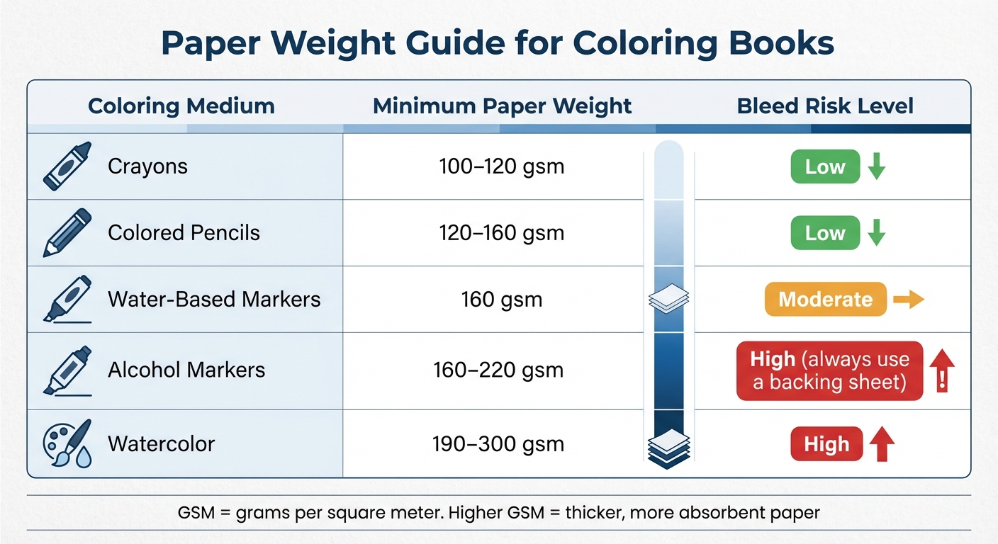
Here’s a quick guide to paper weights and their suitability for different coloring tools:
| Coloring Medium | Minimum Paper Weight | Bleed Risk Level |
|---|---|---|
| Crayons | 100–120 gsm | Low |
| Colored Pencils | 120–160 gsm | Low |
| Water-Based Markers | 160 gsm | Moderate |
| Alcohol Markers | 160–220 gsm | High (always use a backing sheet) |
| Watercolor | 190–300 gsm | High |
Before settling on a paper type, test your designs on different paper weights using the tools your audience is likely to use. Flip the page to check for both bleed-through and show-through. This small step can save you from expensive reprints later.
Next, we’ll dive into how white lines and streaks can disrupt your designs and how to address them.
sbb-itb-c02bfb4
White Lines or Streaks Across Pages
After dealing with ink bleed-through, another frustrating issue that can ruin print quality is white streaks interrupting your design. These streaks, which appear as thin, blank lines across text or images, create gaps where ink is missing. As Inkjets.com describes:
White lines show up as thin, blank streaks running through text or images. They often look like missing data in the print job.
What Causes White Streaks
The most common cause of white streaks in inkjet printers is clogged printheads. When ink dries inside the nozzles, it blocks the flow and leaves blank spaces on the page. Partially clogged nozzles can also misdirect ink, resulting in those streaks. Dust or debris on the paper might deflect ink, leaving gaps once the particles are removed.
Low-quality print settings can make the problem worse. Economy modes, for instance, use less ink and speed up the print process, which can result in horizontal gaps or banding. Breathing Color explains:
When the passes have a gap between them, you will see white lines in the print. This is actually an absence of color!
Other contributing factors include low ink levels and operating the printer in cold environments - particularly below 59°F.
How to Prevent White Streaks
To tackle white streaks, start by running your printer's cleaning utility, such as the Printhead Cleaning or Nozzle Check feature. For stubborn clogs, you may need to run the cleaning cycle several times. If the automatic cleaning doesn’t work, check your printer’s manual for instructions on manual cleaning using a lint-free cloth and distilled water.
Switching to a higher print mode - like Standard, High Quality, or Presentation - can help. These modes slow down the printhead, allowing it to deposit ink more precisely and reduce banding. Also, make sure your printer's paper type setting matches the media you're using. For example, selecting "Matte Photo Paper" for heavier cardstock ensures the printer applies the right amount of ink.
Before printing on expensive media, test on regular paper and brush off any dust to prevent debris from interfering. Printing at least one page per week can also keep the nozzles from drying out, ensuring consistent ink flow. With these steps, you can eliminate white streaks and keep your prints looking sharp and detailed.
Alignment and Sizing Problems
After addressing issues like line clarity and ink bleed, it's important to tackle alignment and sizing errors, which can seriously impact your book's polished look. Even with perfect ink and sharp lines, misaligned pages or uneven margins can ruin the overall presentation. These flaws are particularly glaring in double-sided prints, where the front and back designs must align seamlessly. As Slavena Varbanova from the HelloPrint Team puts it:
Extra spaces between lines of text... or uneven margins around an image... can be incredibly displeasing and distracting to the eye.
Common Alignment and Sizing Errors
Auto-scaling settings like "Borderless" or "Fit to Printable Area" can enlarge images by 3–5%, trimming key details and creating uneven margins. Another frequent issue is duplex misalignment, where the front and back sides of the page don't align properly. As Printable Publishing explains:
If your printer isn't calibrated, the front and back designs won't line up.
Just as 300 DPI resolution ensures crisp lines, careful alignment keeps your design intact. Printers often allow for a trimming tolerance of up to 1/16 inch, so it's crucial to include at least 0.125-inch bleeds along all edges and maintain a 0.25-inch margin on binding edges. Without these bleeds, parts of your artwork may be cut off during trimming. For books with spiral binding or 3-hole punching, add an extra 0.25-inch margin on the binding edge to keep the holes from interfering with your design.
By addressing these alignment and sizing challenges, you can ensure your printed book maintains a professional appearance.
How to Ensure Proper Alignment
To avoid alignment issues, start by selecting "Actual Size" in your print settings instead of "Fit to Printable Area." This ensures your dimensions remain accurate. For double-sided prints, opt for manual duplex mode rather than automatic settings. This gives you more control over the paper feed and reduces the chances of misalignment. Print a test page and hold it up to the light to check the alignment of the front and back designs.
Keep all essential elements - like text, page numbers, and key graphics - within a "Safe Zone" that's at least 0.25 inches from the trim line. This prevents anything important from being cut during trimming. Export your files as PDF/X-1a or PDF/X-4 to lock in your layout and alignment. Lastly, always request a physical proof before proceeding with the full print run. Digital proofs might not catch physical alignment issues that can only be spotted in a printed sample.
Using Tools to Prevent Print Errors
Once you've tackled alignment and sizing, it's time to use professional tools to catch any lingering issues before hitting "print." These tools can identify problems like hairline strokes, incorrect color profiles, or missing bleeds. As PageProof advises:
Mistakes can be costly... Following these steps will help avoid mistakes going to print.
This stage builds on earlier adjustments, ensuring your files are polished and free of errors before printing.
Pre-Press Checks for Accuracy
Pre-press checks are crucial for spotting errors that might disrupt the printing process. Tools that perform automated preflight checks can verify elements like fonts, color profiles, and graphic links. Another key step is resolution verification, which ensures all images meet the 300 DPI minimum - anything below this threshold will appear pixelated and blurry.
Managing color space is equally important. Professional tools can automatically convert RGB to CMYK and fine-tune "rich black" formulas. For example, large background areas typically use a mix of 60% Cyan, 40% Magenta, 40% Yellow, and 100% Black, while fine lines and text should stay at 100% Black to avoid smudging. Additionally, these tools ensure your file includes a standard 0.125-inch bleed on all sides and that critical content remains within the safe zone - at least 0.125 to 0.25 inches from the trim edge. Finally, soft proofing leverages local GPU simulations or ICC profiles to give you a preview of how colors and transparencies will appear on the final printed material.
These steps set the stage for the advanced tools offered by Coloring Book Engine.
How Coloring Book Engine Prevents Errors

Coloring Book Engine simplifies the pre-press process by addressing technical issues like fuzzy lines and misaligned pages. This standalone desktop tool is specifically designed for creating professional-quality coloring books. It operates locally, with no subscriptions or cloud dependencies, and uses a BYOK (Bring Your Own Key) model. This approach allows you to control AI-related costs while keeping your data private.
The software's batch processing feature applies pre-press checks across all pages, and its KDP-ready export ensures that margin and gutter requirements are met automatically. Palette matching provides accurate color previews, while local GPU simulations let you visualize the final output before sending files to the printer. All exports are formatted as PDF/X-1a or PDF/X-4, guaranteeing compatibility with commercial printers.
Coloring Book Engine is available for a one-time purchase of $99 for a Personal license or $299 for an Organization license (for up to five users), both of which include lifetime access.
Conclusion
Print errors - like blurry lines, uneven thickness, bleed-through, or misalignment - can easily ruin the professional look of a coloring book. As Don Hutcheson puts it, “predictable, repeatable color is key,” a principle that holds true for every stage of print preparation. Spotting these issues early not only saves money on reprints but also protects your reputation.
To ensure top-notch results, focus on the essentials: a resolution of 300 DPI, CMYK color mode, and a 0.125-inch bleed with clearly defined safe zones. Converting text to outlines, working with vector formats, and performing thorough preflight checks before exporting are also critical steps. These practices set the stage for smooth, high-quality production.
FAQs
What can I do to stop ink from bleeding through the pages in my coloring book?
When it comes to avoiding ink bleed-through, opting for heavier matte or uncoated paper is key. Look for paper in the range of 90–120 lb (approximately 160–200 gsm). This type of paper absorbs less ink, making it ideal for coloring projects. Another tip? Adjust your printer's ink density settings to prevent oversaturation, as too much ink can lead to bleeding. If possible, use a high-quality printer that’s built for precise and clean printing - this can significantly improve your results.
How can I ensure consistent line thickness when designing coloring books for print?
To keep the line thickness uniform in your coloring book designs, it's best to work with vector-based design tools. These tools ensure your lines stay sharp and scalable, no matter the size. On the other hand, raster images can lead to blurry or uneven lines when printed, so it's a good idea to steer clear of them.
Another useful tip is to print a few sample pages of your designs. This lets you spot any issues with line quality or thickness early on, giving you the chance to make adjustments before finalizing your work. Taking this extra step ensures your coloring book maintains a polished, professional look.
How can I fix alignment and sizing problems when printing coloring books?
To get your designs print-ready, start by adding a 0.125 in bleed to your pages and setting your artboard to the final trim size plus this bleed. This ensures your artwork extends fully to the edges after trimming. Keep all critical elements within the safety margin so nothing important gets accidentally cut off.
When exporting, save your file at 300 dpi in a PDF/X format, such as PDF/X‑1a or PDF/X‑4, to achieve the best print quality. During printing, choose 'fit to paper' or turn off automatic scaling to ensure the dimensions remain accurate. Following these steps can help you avoid common printing pitfalls and ensure your final product looks polished and professional.